
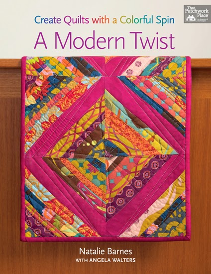
Today I'm sharing a little bit about a new book, A Modern Twist: Create Quilts with a Colorful Spin![]() by Natalie Barnes. Back in 2010 (where does time fly?) I was part of a Bee with a group of talented quilters - most of whom I had never met in person. Natalie was one of them. A couple of years later I meet Natalie randomly at quilt market and after chatting for a minute, put two and two together and realized we had both been part of that same Bee. It's always so fun to make a connection like that with someone in real life!
by Natalie Barnes. Back in 2010 (where does time fly?) I was part of a Bee with a group of talented quilters - most of whom I had never met in person. Natalie was one of them. A couple of years later I meet Natalie randomly at quilt market and after chatting for a minute, put two and two together and realized we had both been part of that same Bee. It's always so fun to make a connection like that with someone in real life!
Natalie is an avid quilter and pattern designer and now has this new book, A Modern Twist, with quilting design tips contributed by Angela Walters. Natalie asked if I would be interested in sharing some thoughts about her book.

Natalie as a strong personal style as well as design aesthetic honed by working for years as a professional interior decorator. She shares a lot of great tips for developing your own style by looking at the fundamentals of COLOR, COMPOSITION, and CONTRAST.
Today I'm going to talk a little bit about the us of CONTRAST in quilt design.
For me the use of Contrast is fundamental to creating a well-designed quilt. There are three areas where I feel like Contrast makes a difference: Color, scale, and texture.
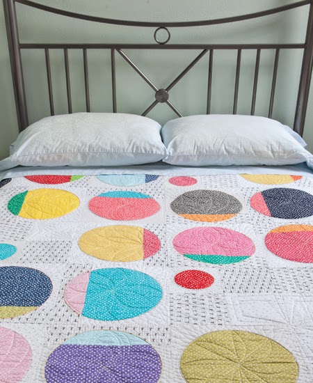
I love playing with color in my quilts. Since I love a scrappy style, I often employ a solid unifying color (most often white) to give the eye a place to rest and to create some contrast for the busy prints and colors. Here's an example from A Modern Twist - the light background provides a great contrast for the colors of the circles. Also, having different shades of the same colors creates visual interest.
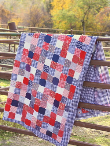
In the photo of the table runner above, the purple solid provides a nice contrast with the other prints, adding to the design motif.
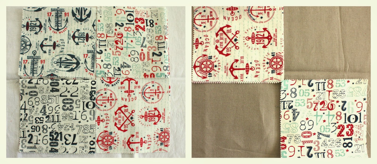
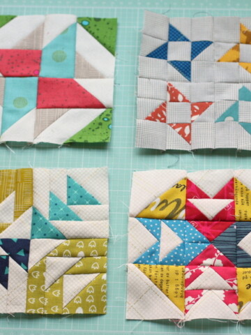
Scale can also create contrast. Sometimes you may want to use a similar color palette for one quilt. By getting a variety of scales of prints, you'll have more visual interest as the contrast between the different scales will best show off the prints. The fabrics in the above picture on the left, are all different, but the scale of their design motifs is very similar. It's hard to see any contrast in those blocks. On the right, two of the blocks are placed in a similar four-patch layout with two contrasting colors - in this case the tan - which helps the design motifs in the prints really show off.
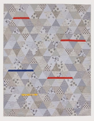
In this example from the book, there are a few high-contrast colors included, but most of the colors in the quilt are monochromatic. The scales of the prints however, is what brings interest and contrast.
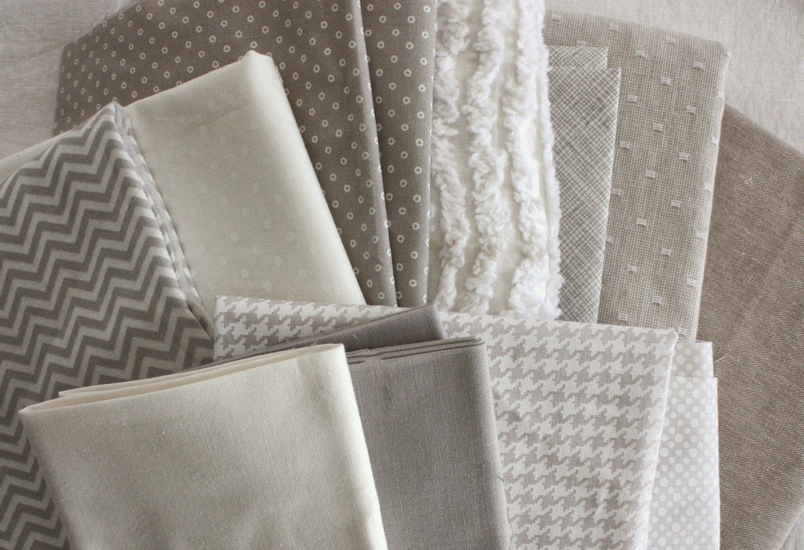
Another form of contrast is texture. This pile of fabrics is all in very similar colors/tones. But the thing that makes it interesting is the variety of textures included. Such as the chenille, the linen fabrics, etc. There are also a few different scales of prints.
Employing contrast in design, is totally personal. It doesn't mean it has to be high-contrast. Sometimes minimal contrast can make something more subtly interesting. It is fun to play with and be aware of the contrast in our quilts to make them interesting.
Modern Twist is available on Amazon, from the Martingale Store, or from your local sewing store.
Feel free to visit any of these other designers to hear more about Color, Contrast, and Composition or for chances to win a copy of A Modern Twist.

Debbie
The book looks great. Thanks for the chance to win. (debbie at wowilikethat dot com)
Rosalind Gutierrez
Unique style of color & contrast and I like the Circle quilt design.
suzanne, dutchess county NY
I love the contrasts between the very low value fabrics with many different textures and the bright vivid colors.<br />So fun.
gigi
Thanks for the interesting discussion and the chance to win.<br />[email protected]
Lindsay Rodems
That monochromatic quilt is gorgeous! Thanks for the great examples of contrast!
Patricia
Would love this book. I always need help with picking out colors. Thank you for the giveaway.
Bev
Thanks for this post and the giveaway. I have a group of colors that I love to use but now all my projects are starting to look alike. I need to expand my repertoire to include other colorways! Always enjoy your blog!
Carol
What a great book with many wonderful projects and ideas! Thanks for the giveaway!
NanaDiana
I have not quilted in a long time but seeing this really puts me in the mood to do it again.<br /><br />I won't sign up for the giveaway because I just won something- I'll let a "real" quilter have my chance. xo Diana
Debby
I would love to learn more about color, composition, and contrast. Looks like a great book.
scottylover
Thank you for the lesson! I struggle sometimes with contrast and this is very helpful!<br /><br />I follow Natalie's blog and amazed at her work, just as I am amazed by yours. It's so neat that you met by chance!<br /><br />Sandy A
Karen - Quilts...etc.
love those circles!!
DonnaM
I sometimes struggle with picking contrasting colors, so this book sounds like it could help. I especially love the circle quilt!
Lisa Marie
Looks like a great book! I'm especially intrigued by the neutral quilt with the pops of color. I haven't tried anything like that, but now I want to!
Anita
So many wonderful projects in this book! I also enjoy all the different tips the participants of this blog hop gives.
Deb
Sounds like a book that I would enjoy learning from.
Tamie
This looks like it would be a great addition to my library. Thanks for sharing your thoughts.
Kathy Davis
Love the gray prints and textures.<br />Kathy Davis<br />[email protected]
Allison
Great tips! I think it's neat when selecting fabric for a quilt when you reach that moment where it looks just right... Enough contrast with scale and color.
klstitches
Following this blog tour is so much fun, It sure is a small world, huh! I cannot wait to own Natalie's book, it has to be great. Her booth at the shows always draw me in, I did not know she was an interior decorator! Thank you for your blod post on her book..... [email protected]
Kristy
What a fun book! Thanks for sharing!
Kathryn
Thanks for the pictures to demo the point you are making. They are worth a thousand words!
Ioleen
Love the low volume quilt with the strips of colour. Thanks for the chance at winning this lovely looking book.
Tori
Definitely trying to use more contrast in my quilts lately. It really does make such a big difference. Right now I'm working on my first white background quilt and I can't wait to see how it turns out!
anna brown
love the book and your ideas are help full.......ty for [email protected]
Tiffany
This book looks really interesting. Thanks for sharing with us!
Shawna
I love the ideas this book shares
sincerely yours
Looks like this book has lots of helpful information! Would love to have a copy.
Linda
HI AMY! LOOKS LIKE A NEAT BOOK!<br />[email protected]
Becca
It looks like a fun book! And great comments on contrast--I think it's easy to forget that contrast doesn't have to mean HIGH contrast.
Holly Rundberg
I have been looking for the perfect quilt design for my bed, and I just found it! The circle design is simple and unique at the same time. Love it!
Karen
Amy, thanks so much for the info on contrast! It's really helpful to me as a beginner.
Carol
I definitely must have this book. I'm looking forwards to seeing all the lovely quilts in it.
Sarah
Thanks for the ideas, and the chance to win. [email protected]
Veronika
This book looks so great! Would love to explore the whole thing 😉
Carol Womack
I love the idea of analyzing what makes a quilt "be". Right now I don't like quiet quilts, so high contrast for me!
marie
I love all the grays.
kathleenmcs
Love the vivid contrasts! They motivate me to get back to making a baby quilt before the baby grows up! Thanks.
Andrea
What a fantastic looking book! Thanks for the giveaway.
Lauren Maedge
Such an awesome book! Hope to read more!
Ann Dunn
I'm getting really inspired by visiting these blogs. Perhaps some of the tips provided will sink into my brain. Thanks for hosting today's blog. <br /><br />anndunn24(at)gmail.com
vinaya pai
Oh what a gorgeous book. I'm so happy to have a chance to win, thank you! !<br />
GO STARS!
That triangle quilt is awesome! I've been looking at triangle quilts and I think I've found the perfect design.
ma40422
Love Natalie Barnes hot pink table runner.
Karen
Thanks for this discussion on contrast. The photos show great examples of your points.
OhioLori
Thanks for sharing this info...and chance to win this Book! 🙂 Love the pictures too..my Grangirlie would loooove the Circles! 🙂
Teresa in Music City
I would LOVE to win a copy of Natalie's book!!! I enjoyed your thoughts on contrast very much. It's the one element of a quilt which makes or breaks it I believe. But I admit I had not considered the different sizes of prints or the fabric textures to be part of the contrast element. I can see I still have much to learn!
Jusmom1
Thanks so much for the chance to win!
Gemini Jen NZ
Great tips! Thanks for sharing them!
Laura T
I'm always drawn to texture in fabric. For me that is what makes it sing! Great discussion and information! <br />LauraT
Judy Cinerari
Any book which gives me more confidence in choosing fabric (eecially colours) is a winner for me. Thanks for the giveaway.
Beth
I am a big fan of Natalie and it is such fun to see so many other quilters I admire singing her praises as well. (See? Hear? My metaphor is mixed, my admiration is pure.)
Naomi Raimon
love your comments about contrast, and the book looks beautiful! thanks for the chance to win it.
Marianne
I love the table runner and I'd really enjoy the book. Thanks for the giveaway.
craftygramma
Wow. I love that table runner.This would be a great book to have, such important lessons - and - beautiful examples! Thanks.
Susan Wietzke
Love the table runner. This book looks to be just the thing to improve my skills. Thank you for this chance.
Stacy
Your comments about contradt are so very helpful.
alicuz quilts
Great tips. Thank you!
Barb
Looks like a good book/resource. Thanks for the giveaway.
Bernice Crane
So much to think about when planning a quilt!
Ruth Bradford
Hi Amy, thanks so much for your info on contrast. It is probably the area I have the most trouble with; however, you have made it easier....I didn't think about using texture for contrast. Thanks again.
Maureen
I would love to win this book.
Bobbi D.
That circle quilt! So pretty. thanks for the chance
kay bowen
Put me in the giveaaway. Love color but intimidated !!!!
Elsa
Great post about contrast ~ I'm loving the triangle quilt with the pops of color! <br />Thanks for the sweet giveaway!
Karen
Good info here. Thanks for sharing, Amy.
Thread Head Clare
Thanks for the chance to win the book! I sometimes struggle with how to shake things up with my quilting color choices - often playing it safe and keeping to tried and true combinations. This book would be a welcome wake up!
Betsy
This looks like a great book. Thanks for the review.
SV MQG Retreat
This comment has been removed by the author.
Rosemary
Thanks so much for the info on selecting colors/fabrics/etc. I love to mix both but always need the guidance ... especially mixing different types of fabric. Love chenille and never mixed it with other fabrics. Great book with great ideas Thanks for the giveaway.
Kathy
I definitely need help in this area. However, I am learning, bit by bit! Thanks for the opportunity to win.
Kelly O.
this was an interesting post as contrast isn't something I've given much thought to in my quilting career.... that being said I do often look at a my quilts and determine a need for a solid fabric here and there... this book looks like it needs a place on my sewing shelf!
Greta Honeycutt
Love that grey triangle quilt! Thanks for a chance to win.
Andee
Natalie's book looks great - thanks for the chance to win.<br />Andee the
L Finney
That book looks awesome. Thanks for the chance to win!
Julie in GA
That looks like a great book. Thanks for the chance to win!
Karen N
Texture is a great way to add contrast and something I would not have thought about. Thanks!
Carrie P.
thanks for sharing about the fabric choices. Looks like a great book.
Lisa E
I definitely could use some help with contrast in my quilts. The books looks very interesting!
Kathy
thanks - this is something I have to watch - I tend to get a little too matchy when putting my fabrics together
cookie
Mommy Time - I remember the days! Love your book. Look forward to sewing Circles!
Jean
Thank you for the giveaway. I really enjoyed your post and am going to check out the links.
Kathy Sue
Loved reading your comments about contrast. Thanks for the chance to win a copy of the book. kathleendotlutzatcomcastdotnet
suzie4d
Thank you! Would absolutely Love the book!
Kay Losh
would love to have the book. I find that contrast in scale is really important especially in a monochromatic color family.
Jenny L
I'd love a copy of this book! I especially like the table runner on the cover. It's very colorful! Thanks for the opportunity!
Renee G
This sounds great. I think I would get some great ideas from this. I like the idea of texture --- usually everything I produce has a single texture. Now, I want to go experiment.
neubiewaters
Love this subject in fabric...would love to read
pajtr
Thank you!<br />Great post!<br />(Would love to make that stunning table runner, too!)
Sandra W
What a lovely colourful book. I would love to have it in my library.
Emily Kim
This is what I stress about with each quilt. The "picking out colors that work together"! This books looks like a lovely read!
Amy Deason
Very interesting read! I'm a fairly new quilter an would love to learn more about contrasting, color, and textures. Thanks for the give-a-way. Can't wait!<br />The Stitchery
Aubrey
I love this post! Thanks for the chance to win!
King's Lady
So many things to consider when choosing fabrics! Need this book!
Vikki Gray
I looks like an interesting book!
Donna Cutting
I love that she uses textures in her quilt. This is an amazing book. Thanks
Laura
I love to play with contrast in my quilts. Thanks for the giveaway!
Nena
I love reading your blog, Amy, I always learn so many things! Thank you!
Andee
It would make my day to win a copy of this book - warmer weather finally here and some great inspiration for quilting modern with a twist!
Gill
I love the circles quilt!!
Cecilia
Great quilts in this book. Thanks for the review and giveaway.
cat
Love the table runner. Thank for the great giveaways
modernmanson
Thanks for the contrast lesson. I'm starting to experiment with low contrast neutrals.
Mom C
That looks like an interesting book. If I have an issue with a quilt, it is usually with the contrast. I think I have a good idea what it will look like but sometimes the colors aren't what I imagined. Mostly it's like the 4square pictures, all mushed together without definition. So I'm trying to work on that. Thanks.
Happy Cottage Quilter
This book looks fabulous! Love all the color! Thanks!
Sewgirl
What a fun bunch of quilts. Love all the color! <br />Thanks for the chance at the giveaway.
Susan Stanton
Your explination of contrast was right on. Natalie's new book looks like a winner!<br />yoyopattycakes at hotmail dot com
AmandaA
This book looks gorgeous. So much to learn from, and beautifully presented.
Material Girl
Love, Love, Love that tablerunner. Thanks for the chance to win the book.
Jayne
I love this book! Very educational and gorgeous quilts to boot!
Sandra Jantzi
I am working on expanding my confidence in choosing color for my quilts. This books looks like it will be a wonderful resource in learning more about colors choices.
Gloria Cotten
Great blog! Thanks for the info on choosing fabrics and for the heads up on the book.
Karen in Breezy Point
I learned about contrast the hard way--so important! I love the triangle quilt-very cool!
T
Thank you for the helpful hints and for the chance to win the book, looks great!
Hilary Florence
looks like a really useful and inspiring book
Donna W
This book looks fantastic and would be a great addition to anyone's home library.
one line lane
Texture is a fun way to add contrast. I enjoy using scale mixed in with texture as well.
Fiber Babble
Our guild's guest this evening will be speaking about what makes a modern quilt modern. I've been looking forward to the program for quite a while - I still haven't gotten a clear idea of what's what!
Melissa
Thank you so much for the chance to win!
Melissa
Thank you so much for the chance to win!
apple blossom
thanks for sharing contrast with us today.
sewsilly
I love everything about colors. Thank you for the giveaway opportunity!
janna sutherland
This book looks like a fabulous quilting resource! Thanks for the chance to win 🙂
Walter
Looks like some great ideas. thks. pjrquilter at msn dot com
Margo Yang
Love contrast in a quilt! The book looks great!
QuiltSue
This book looks great so I am keeping my fingers crossed.
Steven and Ginger
What a great guide!
quiltzyx
Natalie's book looks wonderful! Thanks for the chance to win.
Lynn
Great review of the book - makes me want to go right out and buy it.
Sewing Sue
Great explanations for things, thanks for reviewing the book!
nakeytoesquilting
Thank you for reviewing the book! Modern design has moved me out of my comfort zone of primarily primitives and children's prints. I'm loving that dots quilt, so I would love a chance to win this book.
biogrrl
Loving all the posts on this book - looks like a good one!<br /><br />
nicolesender
I'd love to add this book to my quilting inspiration library!
Rachel D @ Just Sew Y'all Know
I struggle with the right balance when it comes to contrast, so this was helpful. Thanks for the giveaway!
Love
Ahhh I am so terrible at picking fabric colors, and it always stresses me out. I am so jealous of people who seem to get it right every time. 😉