
I've been working on couple of different projects recently where I played around with different fabric combinations AND had the thought to take pictures during the process. I thought this would be a good opportunity to show firsthand how different color or fabric choices can change the whole look of a quilt.
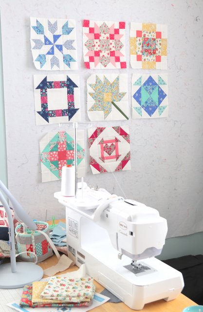
First of all, I've been catching up on my 2022 Riley Blake Quilt Block Challenge blocks. This month (March) 4 quilt blocks were released (since there are 5 Tuesdays in March.) This week is a catch up week and then there will be three new blocks in April and again in May (with a catch up week the last Tuesday of the month) for a total of 16 quilt blocks.
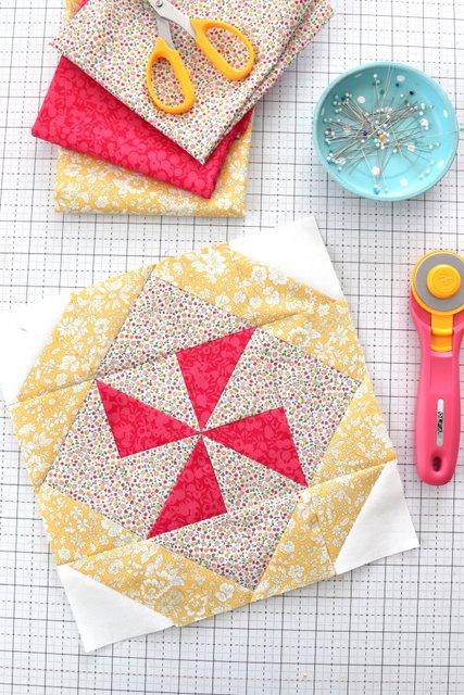
Last week Block 10 was released. This block is called Windblown and designed by yours truly. You can find the free printable quilt block pattern for this block here.
This is a quick and simple block. It's been a lot of fun to see everyone else's blocks because color and fabric placement can change the entire look of the block! You can see other blocks by checking the #RBDBlockChallenge hashtag on Instagram.

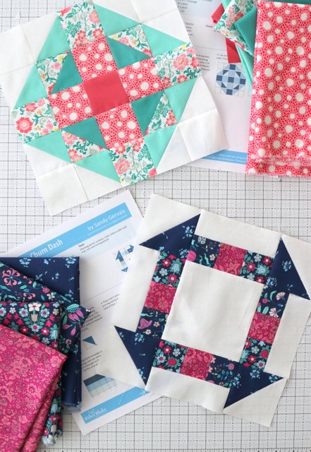
I also finally got caught up on Block #9 - Lynx designed by Amanda Niederhauser (free pattern available here). The fabrics I originally cut for this block are in the center photo - but I didn't really love it. So here's three different fabric variations that I played with. Another example of how fabric placement can change the look and feel of a quilt block.
Below you can see the final fabric combination I went with. I decided less busy for the block since the combined blocks are kind of busy all together.
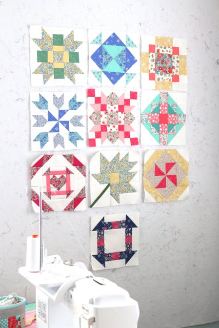
Here are all 10 of my 2022 Quilt Block Challenge blocks so far. You can find the printable block instructions for all 10 blocks here.
For my fabrics I’m using prints from Liberty of London quilter’s cottons from the Flower Show Midsummer and Midnight Garden collections mixed with Riley Blake’s Confetti Cotton solids. I’m using Confetti Cloud as for the white background.
If you’ve missed my earlier blocks you can see January’s blocks 1-3 here and the first block of February (Block #4) here, Blocks 5-6 here, and Blocks 7 & 8 here.
How a different border changes the look of a quilt
Have you ever dropped off a quilt to the long arm quilter and then stewed about it enough to go get it back and change it? 😆🙋🏻♀️
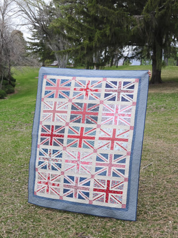
I just did that with my latest Union Jack quilt that I've been working on. I'll tell you about that in a minute. Here are some examples of how a border changes the look of a quilt:
This version of my Lattice Quilt pattern has lots of colors in it, but by using a green border, green becomes the dominant color and makes it a mostly "green" quilt.
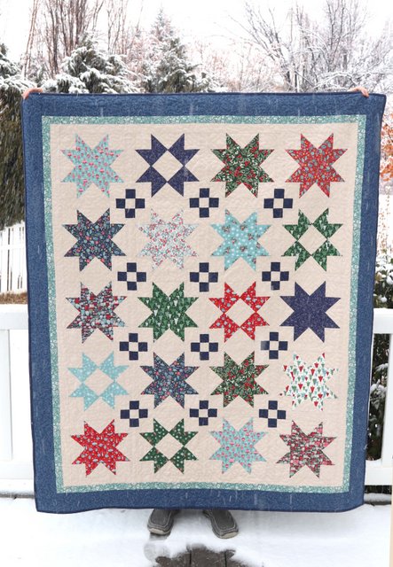
For this quilt using Christmas prints I used a blue border, making it more of a winter quilt than a Christmas only quilt. If I had used a red print for the border, it would have pulled out the reds in the quilt and definitely given it more of a Christmas feeling if that was the look I was going for.
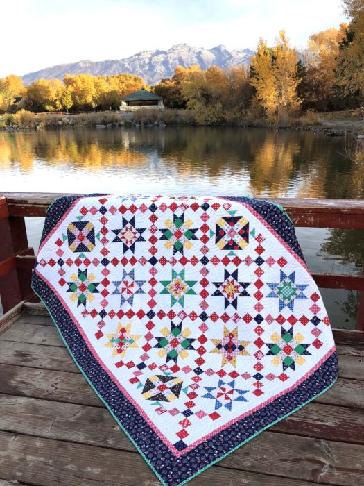
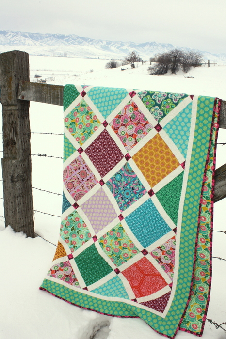
Here's another example of a multi-color sampler quilt. Before the borders were sewn on this quilt, red was the dominant color because of the crossing chain blocks. Had I gone with a red border, it would have been a really red quilt. Choosing a navy blue border created some nice contrast to the red and brought out more of the navy in the blocks.
There's not right or wrong when choosing a border - it's all personal preference. I just think it's fun and interesting to see how a border changes the look and feel of the final design.
Since it’s not every day that I sew two different borders on the same quilt - here's a good example where you get to see the effect a different border makes. Here is how this Union Jack quilt looks with 2 different borders (from close up and far away.) In this case both borders are blue, so from far away the difference isn't drastic. In this case it's the close-up version that gives the quilt a different vibe.
See below the different between a busy, multi-color floral border vs. a more 'solid' blender blue border:

Here’s the back story: I originally added a floral border to this quilt but I kept having nagging second thoughts. I always love a good Liberty floral, and had I been keeping the quilt I would have left it. (This floral is from Liberty Winter Flower Show).

But since I’m making this quilt as a gift for someone else I decided it needed to be a little more tame/generic. So I called my quilter (who was just about to put the quilt on the machine) and ran to pick it up so I could make the change.
I had a small piece of this Buttermilk Basin Basic Navy Stars print and loved how it gave the busy quilt a more neutral frame, but still some contrast and texture. I found more yardage from The Quilter's Crossing (and huge shoutout to them for super speedy delivery) and was able to get it back to the quilter asap.
Now that the quilt is in the binding stage and I'm really pleased with the choice. If I'd been keeping the quilt for myself I would have left the Liberty print, but since it's going as a gift to someone else, a little more "boring" or neutral was the right choice.
Which do you like better? (Again, no right or wrong answers here!) And there are no hard fast right or wrong rules about choosing fabric for a project. Feel free to play with what looks/feels right to you. And if the quilt is a gift, keep in mind who the quilt is for and how they might use the quilt.
Hoping to get out this week and get some pictures of the finished quilt. Union Jack quilt made with my Regent Street Union Jack pattern (original size, not the Super Size version).

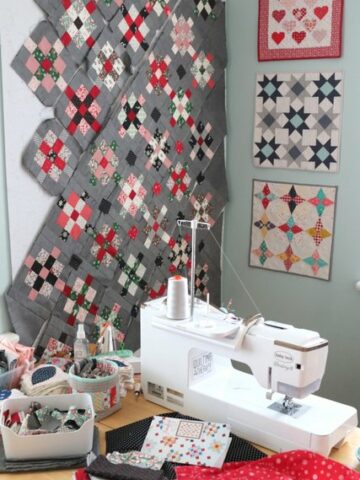
So that's what has been on my sewing table recently. Also coming soon (as seen on my design wall) a Baby Lattice quilt version using Notting Hill fabric.
Sewing time has been somewhat limited recently. Also you may have noticed Diary of a Quilter is in the process of a major site redesign. There has been a LOT of tech work going on behind the scenes around here (which is not my favorite kind of work).
I've wanted to update the layout of my website for a long time to make finding content easier and more accessible. There is over 12 years of quilting talk - tutorials, patterns, tips and tricks, etc. on this site and my goal is to make it all much easier to search and access.
Right now visiting Diary of a Quilter may feel a little like going to your favorite grocery store and having all of the aisles rearranged. (I hate when that happens!) But hopefully in the long run it will pay off. In the mean time, we're still working out bugs, design issues, etc. Hopefully that gets finished up quick.
If you'd like to give any feedback on the site and what I can do to make it better, I would love to hear from you! You can tell me what you think in this survey here. I'd really love to hear what you think.
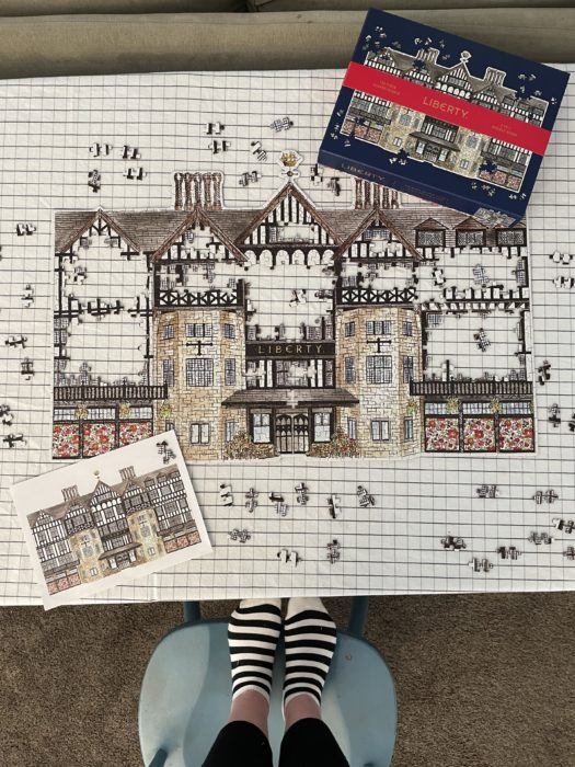
Confession: The other reason I haven't been doing a ton of sewing lately. I was distracted by this amazing Liberty of London puzzle my sister gave to me. Does she know me well or what?!
Not going to lie - it got a little tricky with all of those black and white windows, but still it was a fun, satisfying finish.
Rosemary B
Oh Amy, I love the puzzle. Do you ever save the puzzle and have it framed? You can do that and it would be a treasure!
I love your blog. I love all of the advice you offer.
Deborah Lunsford
Wonderful blog. I will definately visit your site. I love liberty fabric as well.
I prefer the liberty border for your quilt but i get the reason you changed.
Good luck.
Theresa
Thank you. This was so interesting! Love your emails and appreciate your patient teaching style.
Donna L.
I too am a Liberty fan and I love what you do with the fabrics. I'll be going to London in June and will be taking some of your ideas with me. Thanks for the inspiration. I may just have to buy the puzzle, too.
June
Yes I love the Liberty border. It just sets it off. But I also know that depending on who gets it might make the difference. Love your site too.
robby
I liked the grey border on the quilt the best. I cant tell you why, but the flora just didnt do it for me. Maybe red would have been good, but not floral---I think that was the issue. Love your puzzle---would look fabulous on a frame.
Alys
I like the grey border as well. To me it helps me to focus on the blocks.
Mary B
Thanks for such a great article on fabric choices. I always struggle with that, but you made it look so easy. I do prefer the gray border on your Union Jack quilt. I think it makes the blocks pop. With the floral border, it seemed there was too much competition between the blocks and the border.
choxton
I loved the floral, but whoever the quilt is for, may not be that into flowers, really the quilt is lovely both ways.
Deb E
I loved the floral binding, without any hesitation - it ties the print in with all the gorgeous florals you used on the main body of the quilt. I'm sure whoever receives the quilt will absolutely love it. But I'm with you - had it been for me, I'd want the original choice you made.
mary stockel
Love the gray border on the quilt, especially for a gift. Love your puzzle too! Thanks so much for all your information, always something new to learn 🙂
Marilyn Stephens
First, I love the floral fabric and the red, but, I prefer the second choice, which became your first choice. I think the floral took away from the from the quilt, too busy. The quilt is busy enough and the second border calms things down some. Second, you gave me some things to think about when I get ready to put my next border on a quilt. Thank you
Jackson M. Watkins
Hi Amy, I'm a huge fan & follower... I LOVE the Liberty border much better than the other. Not so much because of the floral aspect, but because it gives the border more color & texture I believe. Also, in one of the photos, you have three Mini-quilts hanging on your wall behind your sewing machine. I absolutely love the bottom quilt pattern. Could you possibly tell me the name of the pattern and where I could find it? Thanks so much.